We’re getting closer to the launch of Android P — Google dropped the final developer preview just last week, and we’re expecting to see the finished product released later this month. Whether it’s called Pecan, Popsicle, Pancake, or something else, it’s bringing a lot of new features to Android, including a handy new one-button navigation system that does away with the black bar full of software buttons.
It’s great in theory, but there’s something missing from Google’s new navigational system. You can tap the new “pill” button at the bottom of the screen to go home or long-press it to launch Google Assistant, which makes perfect sense — that’s exactly how the home button has always worked. You can also drag the pill to the right to switch apps, either quickly to jump to the previous app or with a slower drag to open a horizontally scrolling list of apps.
There’s inexplicably no gesture to go back, though, so Google just left the back button in place when you’re in an app. Seriously?
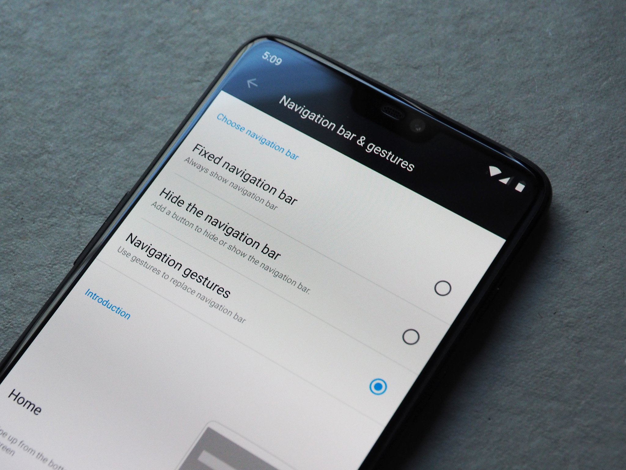
What was Google thinking, not adding a back gesture?
Luckily, Google isn’t the only one working on simpler navigation. OnePlus has a new way to get around the OnePlus 6 without any buttons at all — instead, it’s all based around swiping up from different spots at the bottom of the screen. Swipe up from the center to go home, swipe up from the left or right to go back, or swipe up and pause to launch the multitasking pane. It’s nice to win back the bottom of your screen, but I never cared for this navigation either, since switching apps is considerably slower and clunkier than with a traditional software button.
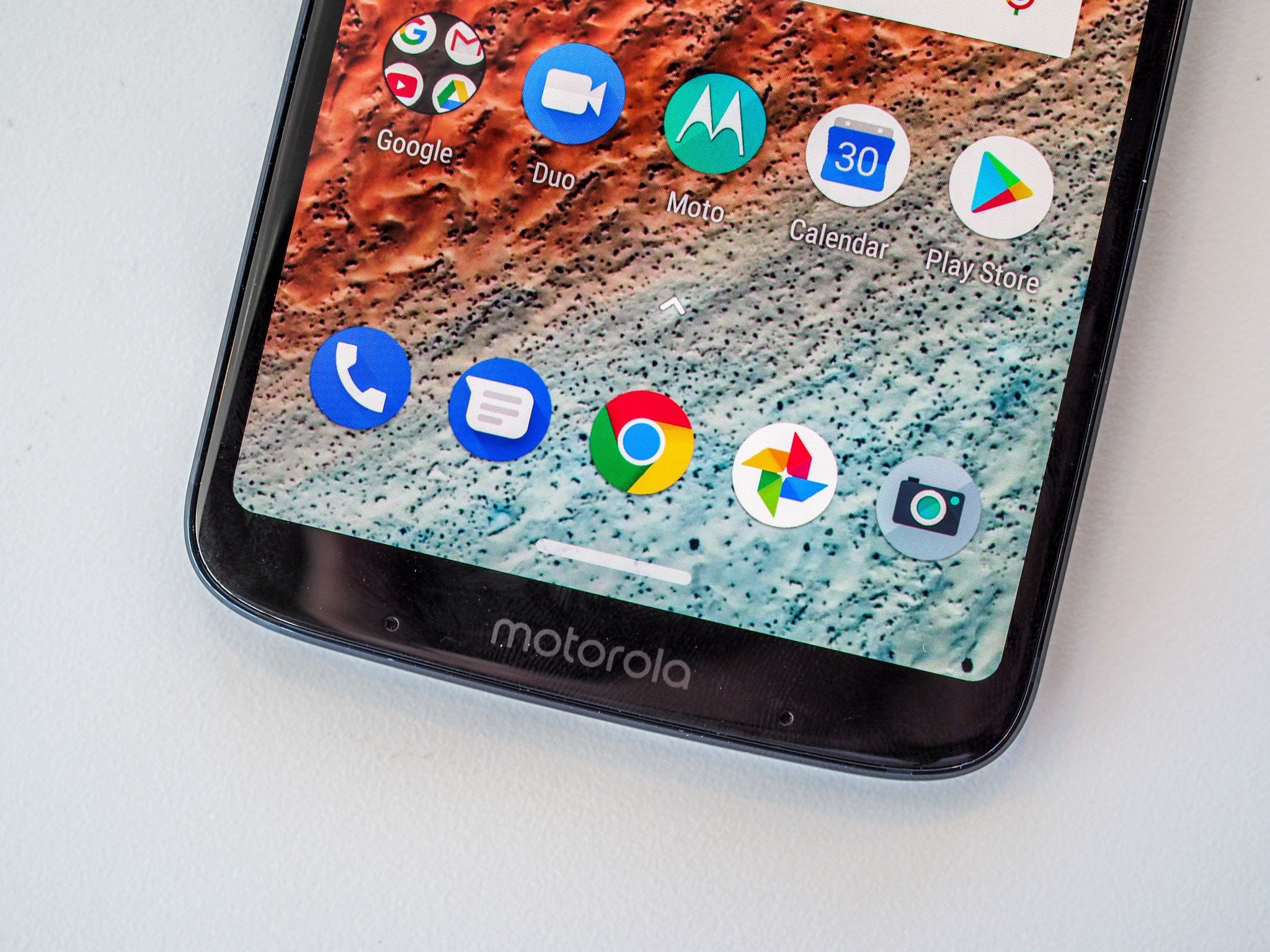
Motorola debuted its own one-button navigation format with the Moto Z3 Play, and while it isn’t perfect, it’s by far my favorite implementation, and in my opinion the easiest to adjust to. Motorola uses a pill-shaped button just like Android P, but it essentially mirrored the button layout we’ve all gotten used to on Android over the last few years — tap the pill to go home, drag it to the right to access recent apps, and drag it to the left to go back. See, Google? It’s not that hard to add a back button gesture.
Coming from pretty much any Android device (aside from recent Samsung phones, which default to a reversed order with the back button to the right of the home button), this should feel super natural to move to, since you’re just moving the pill towards where the respective buttons would normally be anyway. Unfortunately, with Motorola’s pill you still get a slim black bar at the bottom of the screen, but it’s significantly shorter than the bar when using the Android’s standard three buttons, so I’ll take it for now.
Ultimately, though, I’d love for Android to eliminate that black bar holding the button entirely. I mean, isn’t it basically the equivalent of a notch at the bottom of the screen?
What say you? Have you been using any form of one-button navigation, or are you still perfectly happy with the three-button format we’ve had for years? Let me know in the comments below!
source:-.androidcentral.

