It’s a distinctive part of your Mac but the Dock is big and it doesn’t do a lot. Now, uBar wants to replace it with a tool that saves space and adds functionality. AppleInsider tries it out.
We were only saying the other day that our Docks are getting a bit full. Of course there is always the option to remove applications from it and, true, there are apps in our Dock that we haven’t opened in months. Yet tidying up is foolish talk and especially so when instead you can use uBar 4.0.7 to remove or at least postpone having to do anything.
This app was made for us. Currently our regular macOS Dock holds 50 items. That does include the Trash, the Finder, Siri and the App Store. It also includes one document, a FileMaker Pro database that we use daily. However, everything else is an app we have chosen to add there. For some reason.
Often, down the road, we’ve forgotten the reason. For instance, it’s a mystery why we have that FileMaker Pro document when every single day we forget it’s there and instead open the FileMaker app. The FileMaker Pro app is of course in our Dock.
Truly, looking at it for you now, we can see instantly where we should cut back. That document can go and it might as well be followed by iBooks as we always read those on our iPad.
That brings us down to 48 items in the Dock and that’s far more sensible.
Or rather it is when you replace your regular Dock with uBar 4. Our 48 items stretch across the full width of our 27-inch iMac screen. By comparison, uBar gives us at least all the same functionality but does so in just under half the space.
Compare and contrast. At the bottom is our regular macOS Dock. In the middle is uBar showing names alongside every app. Then at the top there is uBar when it’s only showing app icons.

That’s half the space for the items we already have and yet uBar also adds two more. One is a handy thing to have: it’s a clock that sits at one end of the Dock and looks a little reminiscent of the one in the Windows taskbar.
If you hover over that clock, though, the concise digital display springs up into an analog watch face plus a calendar.
You can’t use the calendar for anything other than checking the date —it doesn’t show appointments —but it’s nicely designed and it does its job. We might not buy uBar for it, but when you’ve got it, you like it.
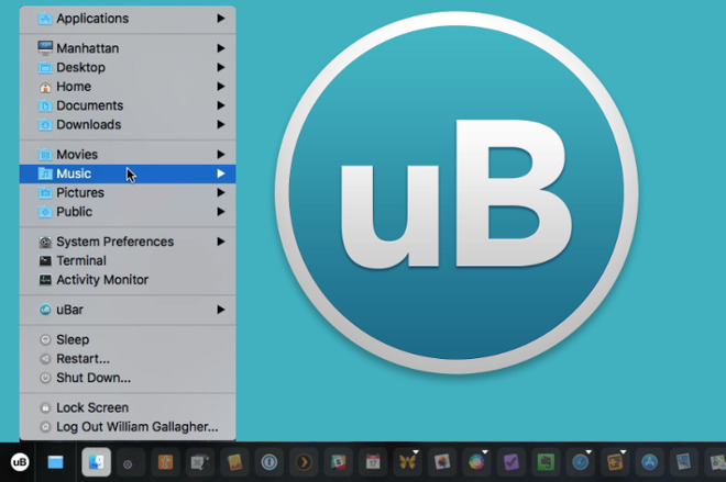
Whereas the other extra item uBar adds is very much worth buying the whole app for. It’s a little uBar icon that by default sits at the very left of your screen and can be configured to spring up into life with a single keystroke.
When you press that key, you are also transported to Windows-land but with a bit of class and style. The uBar icon displays a popup menu with options for system sleep or shut down. It’s got quick access to your documents, music and more. Plus it’s a fairly quick route to your applications.
Your mileage will vary there, with any luck, because as well as a lot of Dock items we do rather hoard apps. This makes uBar’s list of them take an age to scroll down. You can, though, tap a letter when you’re scrolling and it will leap to the apps beginning with that.
Much faster and to our mind far more convenient is the quick access to each individual part of System Preferences. Rather than finding System Preferences and then searching for what you need, this lets you get to, say, the Dock preferences with one tap and a few presses of your arrow keys.
It would be good if you could use those arrow keys to move along uBar’s version of the Dock but you can’t. That’s mouse- or trackpad-only. When you go to click on an app, though, you can hover for a moment and get a preview of it. If it’s a writing app then you might see a shrunken preview of the documents currently open in it.
If the app isn’t something that uBar can recognize or perform a Quick Look on then you just get the app’s icon. However, if you’ve got three documents open in such an app, you’ll get three icons and it’s clear how to pick from them.
That’s handy. The one-key uBar menu is a startling time-saver. The ability to choose whether your apps are displayed as small icons or together with their names is excellent. Plus that clock is first-class.
Only, call us traditionalists, but we like the macOS Dock. We promise to use it better.
In the meantime, though, uBar 4 costs $30 for an individual licence and requires macOS 10.10 or higher. It’s available direct from the developer or as part of Setapp.
[“Source-appleinsider”]

